Warning: The following post is an usability rant aimed squarely at the incompetent software developers contracted to Citibank. Please enjoy the ride.
When I went to the UK about 4 years ago, I opened a Citibank UK bank account so that I could get paid whilst I was working. The actual account is really great – much better than any account you can get over here in Australia. There are no fees at all – none, nada, zip. At they time they also provided some great overdraft facilities. As I still occasionally do work for UK clients, and as it costs me nothing, it remains opened.
Significant point #1: I can’t go to a branch, and I need to call international to talk to a customer support officer – I rely on internet banking heavily.
Unfortunately, the online banking experience does not reflect the quality of the account. There are so many usability issues, the developers should be brought before some sort of tribunal.
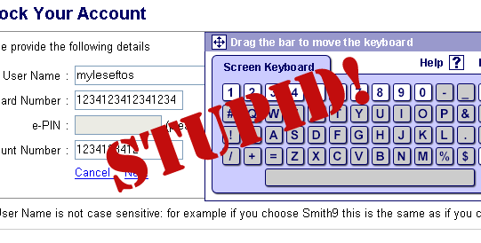
Javascript Keyboard: This is a favourite amoungst banks as they believe it provides security from key logging software. BOLLOCKS! Javascript is a very dynamic language, it would be extremely simple to write a Javascript function that could be injected onto a page which would reveal the password. All a Javascript keyboard does is increase the chance of me getting my password wrong and slows me down. in fact, if someone was shoulder surfing, they would be able able to read my “keypresses” much easier than if I typed them on a normal keyboard. JavaScript keyboards are stupid.

Secret Question and Answers: Next, Citibank requires you to answer one of five pre-defined question/answer pairs. In a previous session, I was required to spend twenty minutes picking and answering questions. Why twenty minutes? Because you need to enter your username, password twice (both times using the previously labeled stupid Javascript keyboard), then finally pick five out of twenty questions, type in answers, then type in answers AGAIN to confirm them. After you enter an answer, they are automatically starred out, so you can’t see them.
Challenge Questions are not secure. A small amount of digging will allow you to get most of these details about someone. Heck, if you can get hold of someones bank statement, you can work out at least a couple of answers. All they do is make it frustrating for legitimate users. I couldn’t remember if I used capitals (To this day, I’m still not sure if they are case sensitive) or whether I used abbreviations. And what happens if my favourite colour changes? I’m screwed. Challenge questions are stupid!

Guess what, I couldn’t remember the specific format of the challenge question I was asked, so I was locked out, which meant I needed to go through the above procedure again. This time, I took too long, so the session timed out.
I click the login link once more, enter my username and password (again, stupid Javascript keyboard) but it confirms that my username is locked. I need to click the “unlock username” link. I click said link, and it tells me I NEED TO ENTER A USERNAME AND PASSWORD. Two problems here:
- Generally people do not expect text links to be associated with text boxes. if you want the data in a text box to relate to an action, make that action a button.
- There is no indication that I need to fill in this information until AFTER I have tried.
Finally, I have navigated to the “unlock username” page. Only to be presented with another stupid form. This time, I need to fill in my username, card number, e-Pin (welcome back stupid Javascript keyboard) and account number. Now, I don’t know about you, but as far as I’m concerned, my credit card number is probably more valuable to a thief than my e-Pin, yet the former is in full view of everyone and isn’t protected by stupid virtual keyboards.

Now, after attempting this frustrating process a number of times, I am completely locked out from my online account and I will need to call the UK to get it sorted out. Go team Citibank.
So what can they do about this to make the process simpler? I think BankWest has got it right:
- They issue a Personal Access Number (PAN) – The number is short, so it is easy to remember, but it is not easily derivable from the account number of any user details.
- they politely remind users that they haven’t changed they password in a while. Which is much nicer then forcing me to do it. If I’m stupid enough to not change my password regularly, even when warned, well that is my tough luck.
Other things worth trying:
- Limit the amount of money that can be transferred in a day, especially for person-to-person transfers – having access to online banking accounts is not much use unless you can transfer the money out.
- Give users the choice of blocking person-to-person transfers and BPay – I only ever check my balance through this system so I have no need for transfer facilities.
The bottom line is these “security” measures aren’t that much more secure that a standard username/password conbination yet they are infinately more annoying and frustrating.
So banks: PLEASE STOP USING THEM.


