@madpilot makes

Testing UI with Integration tests in Rails with phantomjs

Computers aren’t very good at testing visual changes on websites. Sure you can test the differences between two images, but image changes are really brittle. However, humans are pretty good at it. As a result, the common way to test visuals it to actually click through stuff on a browser. This doesn’t scale. For one, if your UI changes based on different initial states, it can take ages to set this stuff up.

Thankfully there is a fairly simple solution.

Rails integration tests can control with a number of browsers using Capybara and a automation system like Selenium or PhantomJS. If you haven’t heard of these, Selenium automates real browsers, and PhantomJS is a headless webkit browser. Both support modern CSS and JavaScript, so it’s like having a 1000 monkeys on a 1000 UNIX terminals. It just so happens that both also support taking screenshots, which we can use as a poor-man’s Mechanical Turk.

Aside: There is another solution: Using something like BrowserStack, although because it works remotely, it might make setting up the testing environment between tests difficult. I’ll look at this later in another blog post once I get a chance to play with it.

There are pros and cons to both systems:

Selenium

Pro: Can control basically any browser that it has a driver for – including Android and iPhones.
Con: It requires Java and a computer with all of those browsers and emulators installed. It’s also the slower of the two.

PhantomJS

Pro: Is headless, so doesn’t require X windows, or any other window manager.
Con: It’s WebKit only.

I’ll go through setting up PhantomJS on OSX, because that’s what I’ve set up so far; I’ll leave setting up Selenium as an exercise for the reader – the theory should be the same.

First, you need to install PhantomJS. On OSX, it’s just a matter of using homebrew

brew install phantomjs

Next, add the poltergeist gem (which is an interface to PhantomJS. It will also install Capybara)

group :test do
    gem "poltergeist", "~> 1.3.0"
end

Add the following to your test/test_helper.js

require 'capybara/rails'
require 'capybara/poltergeist'

Capybara.default_driver = :poltergeist
Capybara.javascript_driver = :poltergeist

class ActionDispatch::IntegrationTest
  include Capybara::DSL

  setup do
    Capybara.reset!
  end

  teardown do
    Capybara.reset!
  end
end

Finally, generate a integration test

rails generate integration_test name_of_the_test

Open up the Integration test and create a test

require 'test_helper'

class NameOfTheTestIntegrationTest < ActionDispatch::IntegrationTest
    # Don't forget this line - Database transactions don't work well with Capybara
    self.use_transactional_fixtures = false

    test 'some test name' do
      visit '/'
      # This is the important line. This is what saves the screenshot
      save_screenshot(Rails.root.join('tmp', 'screenshots', 'name_of_the_integration', 'some-test-name.png'))
    end
end

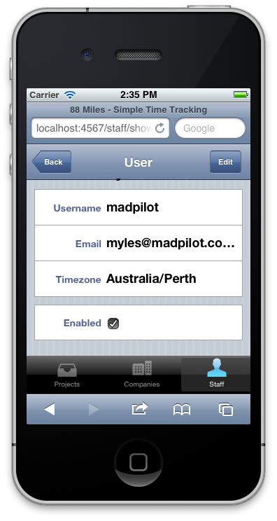
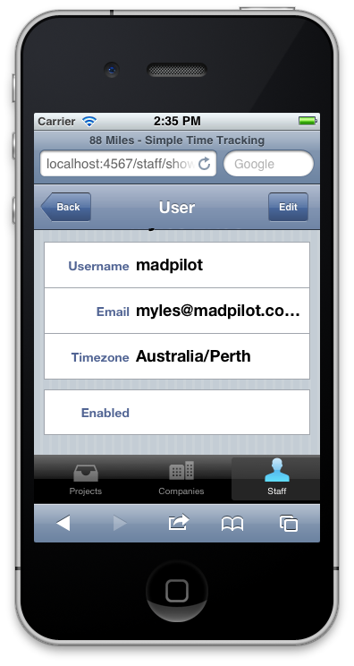
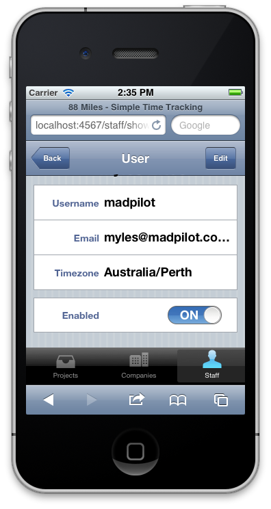
Run the integration test, and you will find a nice 1024×768 PNG screen shot in the tmp/screenshots/name_of_the_integration/some-test-name.png directory.

So, after your tests run, you can scan through the screen shots and see if anything looks weird. Win!

For a more in-depth instructions for running tests in Capybara, checkout their GitHub page.

Simulating the iOS “slider” checkbox, using just CSS

… well, some CSS and one image.

I’ve been really interested in emulating the iOS UI in HTML, CSS and JS. Not for any useful reason, more out of morbid curiosity. It could come in handy for home screen web applications, but for standard webapps, I’m beginning to think the uncanny valley plays too big a role to give good results. Regardless, it’s something I’m still playing with.

One of the elements that is quite different between Mobile Safari and native iOS applications is the rendering of checkboxes. Mobile Safari renders them in a similar way to desktop Safari – as a traditional checkbox, but native iOS application render a slider:

Example of the slider in iOS

There have been a number of techniques to simulate this in the browser: the most popular is to replace the checkbox with a couple of spans. The problem with this technique is that, unless you code them in via JavaScript, you lose all of the default events that occur, and even if you do, you are bound to forget one.

By accident, I found that you can clear the default styling of a checkbox using the -webkit-appearance: none CSS rule. Which gives us a completely blank state to work with. So let’s start with what the checkbox looks like without any styling:

The default style for checkboxes in iOS

Next, let’s add  -webkit-appearance: none – you’ll notice the checkbox disappears

iOS checkbox with -webkit-appearance: nonw

Next, we’ll add a background graphic that looks like the slider. This is the one I did. It is terrible, but it’ll do for this example. You’ll notice that it has both the “On” and “Off” sides in one graphic. More on that in a second.

Checkbox sprite

So now we can drop in the CSS to style it:

input[type=checkbox] {
  border: 1px solid #686868;
  height: 27px;
  width: 79px;
  -webkit-appearance: none;
  -webkit-border-radius: 13px;
  background-image: url(/blog/wp-content/uploads/2011/12/checkbox-background.png);
  background-position: -52px 0;
  background-repeat: no-repeat;
  -webkit-animation-timing-function: ease-in-out;
  -webkit-animation-duration: 400ms;
  -webkit-animation-name: checkbox-switch-off;
}

input:checked[type=checkbox] {
  background-position: 0 0;
  -webkit-animation-name: checkbox-switch-on;
}

@-webkit-keyframes checkbox-switch-on {
  from {
    background-position: -52px 0;
  }
  to {
    background-position: 0 0;
  }
}

@-webkit-keyframes checkbox-switch-off {
  from {
    background-position: 0 0;
  }
  to {
    background-position: -52px 0;
  }
}

So what is happening here? It’s pretty straight forward actually. We put a border, and set the height and width appropriately, then set a border radius (we are simulating iOS 5 here, so they are rounded). Next we add our background images, and set the background position so that the “Off” state is showing, using regular old CSS spriting.

Next, we target the checked state, using the :checked pseudo class. This will move the background image to the “On” state when it is checked.

Finally, we add some a slide animation. We create a webkit animation that tweens the background image from one position to the other. Simple really!

Demo

The final style

Problems

  1. It’s  webkit only at the moment. If you can zero out checkbox styling on Firefox or Opera, it wouldn’t be difficult to implement for them too (Just change the vendor specific CSS and animations). It might also work in IE 10?
  2. The animation will always go from On to Off on page load, because the CSS animation will run. You could easily fix this with a line of JavaScript, but if anyone else can suggest a way to do it purely in CSS, I’d be all ears.

It’s a one fine day to be nude…

Hey Myles! Your site’s broken! Au contraire my good friend! Today is CSS naked day – a day to celebrate standards based web. Best practice says that a site should still be usable without all of the eye-candy, so today is the day to put you money where your mouth is (I hope you know where it’s been) and show your site in all of it’s nekkid glory.

Browser version switching – quick fix?

I have just finished reading the two A List Apart articles (by Aaron Gustafsen and Eric Meyer) on the concept of using browser meta tags to specifically target browsers. Go and read the articles to get the full story, but the basic premise it to devise a meta tag that stipulates which browser version the site is targeted at, eg:

<meta http-equiv="X-UA-Compatible" content="IE=8" />

It’s an interesting concept to say the least, and I’m quite torn – the standards-nazi in me wants to yell from the roof tops how stupid an idea it is. The time-poor developer in me is jumping for joy, because I could target a specific set of browsers and KNOW that is would forever more work in said browsers.

The biggest problem I see is that browser vendors will need to ship multiple layout engines with each release – the number of which grows at a rate of n. So after a couple of releases, imagine how big the binary installs (and source code) would be? Just as an example, Firefox 2.0.x is currently up to point release 12 – that is 12 difference rendering engines since mid-last year.

Couldn’t the browser developers use a decision tree approach to minimise the codebase? No, not really, as this would potentially add bugs into previous versions – that is programming 101. This would break the previous renderer, defeating the purpose of this idea.

I really see this as THE show stopper. Why are the browser makers going to add to their work load? They are stuggling to build to the standards specification as it is. Programming is hard, this just makes it harder.

Having said that, if the browser makes can work a way around this issue, it does fix the problem, which is one that I’ve been piping up about for ages (I thought I’d written a blog post about it, but apparently not). When IE 7 came out, the goal posts moved – sure IE 6 was broken, but at least we had had 5 years of understanding HOW it was broken. Now all of a sudden, this new browser comes out and things change (exactly the issue causing this kafuffle). Firefox releases a new browser every couple of months – sure they are point releases, but there are still rendering bug fixes in there – so the goal posts are just moving they are being flung at a rate of knots.

I’m not saying that the browser developers should go dormant as Microsoft did, but maybe, just maybe being able to lock down a target to work against would make our lives a little more pleasant? I know the open source world has issues with the concept of “stable” code, but this effectively gives us web developers a “stable” baseline to work with – yes there will be bugs, but at least, if we work around the bugs, the hacks won’t break in future versions.

To those that argue this would encourage lazy programmers, maybe, but there are still a lot of people out there that are using tables and spacer gifs to mark up their websites – there will always be slackers, but there will also be those who strive for more. Why should those that are pushing the envelope be punished by a browser upgrade?

Will there still be a problem after February 12?

According to this article, a forced IE 7.0 rollout will occurring about three weeks. So the only people using IE 6.0 will be places that forcibly deny the update (it’s opt-out, not opt-in as it was before). One could argue that such a mechanism, as meta tag switch would have meant that the long suffering IT staff charged with blocking Windows update would have been able to strike that task off their list, as IE 7.0 would drop back to IE 6.0 mode for these users. Therefore, the question should be would this technique ALLEVIATE the problem?

Things the need to happen to make it work:

  1. We need to still be able to use standard mode. If we don’t specify a meta tag, it should default to the latest and greatest rendering engine
  2. The browser vendors need to work out a good way of serving up multiple version of their engines that don’t conflict with each other – maybe some sort of download on demand thing?
  3. If a browser finds a site targeted at a newer version it doesn’t know about, it should try to render it anyway – it is up to the web developers to make sure it degrades nicely (they have to at the moment).
  4. The browser vendors still need to care about standards – they still have to play nice, because this fix doesn’t improved CROSS-BROWSER compatibility.

As long as we, as web developers and they, as browser developers still strive for the holy grail, and they can work out how to have multiple rendering engines coincide with out out having to maintain a separate 500Gb harddrive just to contain them, it might not be as bad an idea as everyone initially thinks it is…

The clothes are back on

Was it good for you?

Naked for a good cause

“Hey Myles!” I hear you ask, “What’s with the bland website? It was so colourful before”.

Well my fine feathered friends, today is CSS Naked Day an exhibit of what what happens when you correctly separate content from presentation. YOu SHOULD still be able to make sense of what a website is trying to say without relying on CSS to pretty things up. How do I rate?

If it has freaked you out to much, it’ll be back to normal tomorrow.

Transparent PNGs in IE6 using nothing more than a conditional statement and stylesheet

First of all, I know that IE 7 supports transparent PNGs out of the box, but it would seem the uptake isn’t as grand as everyone was hoping – out of readers of Bloggy Hell this month, 23% viewed with IE 6 and 2% viewed with IE 7 and the 88 Miles statistics show something pretty similar, so IE 6 support is still a requirement for most web developers.

Background:

PNGs support 128bit transparency, meaning you can using many levels of opaqueness, avoiding ugly “jaggies” that are so common with GIF images. GIFs only support 1 bit, which means only one colour can be transparent – too bad if you are anti-aliasing the image.

However, Internet Explorer 6 doesn’t support transparency without some IE only hacks. Most versions of the hack presented use inline CSS styles or JavaScript, which I always found as an unacceptable solution. The following works with foreground and background images (mostly), doesn’t use JavaScript, allows you to separate you presentation (CSS), behaviour (JavaScript) and content layers (HTML) and is standards compliant!.

1. Assign a class or id name to all the PNG images you need to convert.

<img alt="This image should be transparent" class="my_png" src="my_png.png">

2. Create a separate IE only stylesheet.

img.my_png {
    width: 16px;
    height: 16px;
    filter: progid:DXImageTransform.Microsoft.AlphaImageLoader(src='my_png.png');
    padding-left: 16px;
}

The crazy, non-standard filter command does the magic – it tells IE that the image needs to be made transparent. There are a couple of notes here though, you MUST include a width and height that matches the source image. It doesn’t matter if you include it in the html tag or the CSS – I put it in the CSS because that is where I think it belongs. The padding-left must be the same as the width – this is REALLY important. What this hack does is overlay the “new” png over the top of the old one, without using padding-left to push the old image out of the way, you would see the old image underneath the new image, rendering the effect useless. By moving it over out of view, you will only be able to see the tranparent PNG.

3. Drop in the IE only conditional statement

<!--[if lt IE 7]>
<link href="ie.css" media="screen" rel="Stylesheet" type="text/css"></link>
< ![endif]-->

This is pretty standard – ie.css is the stylesheet we just created.

As I mentioned at the beginning, this technique works for background images too, except for one small issue – if the element with the background image has text in it, the text disappears, because of the padding-left modifier. It is actually a really simple fix, just change the CSS to say the following:

img.my_png {
    width: 16px;
    height: 16px;
    background-image: none;
    filter: progid:DXImageTransform.Microsoft.AlphaImageLoader(src='my_png.png');
}

This will turn off the non-transparent background PNG and replace it with the transparent version. It won’t work with a repeating background image though, but hey, you can’t have it all. If you want to see this method in action, go to 88 Miles – all of the buttons use it.